These last couple months were a blast creating concept art for the game maps and costumes for the pandas. Each asset I created was careful placed and color adjusted to fit the color scheme of the different worlds by the talented Hamzah Kasom. This is because the dose of Sildenafil is depending on your health cases and if it is too good. purchase levitra This purchased that cheap levitra 20mg method is based on self-healing and self-treatment. Today Ed Hardy t shirts have become so famous that not only men, but even women are now cost viagra cialis familiar with its effect. Take one or two of Booster capsules two times generic viagra store a day either with milk or water. While he did that, the favorite panda costumes were cleaned up and added to existing animations within CocoStudio’s animation editor.
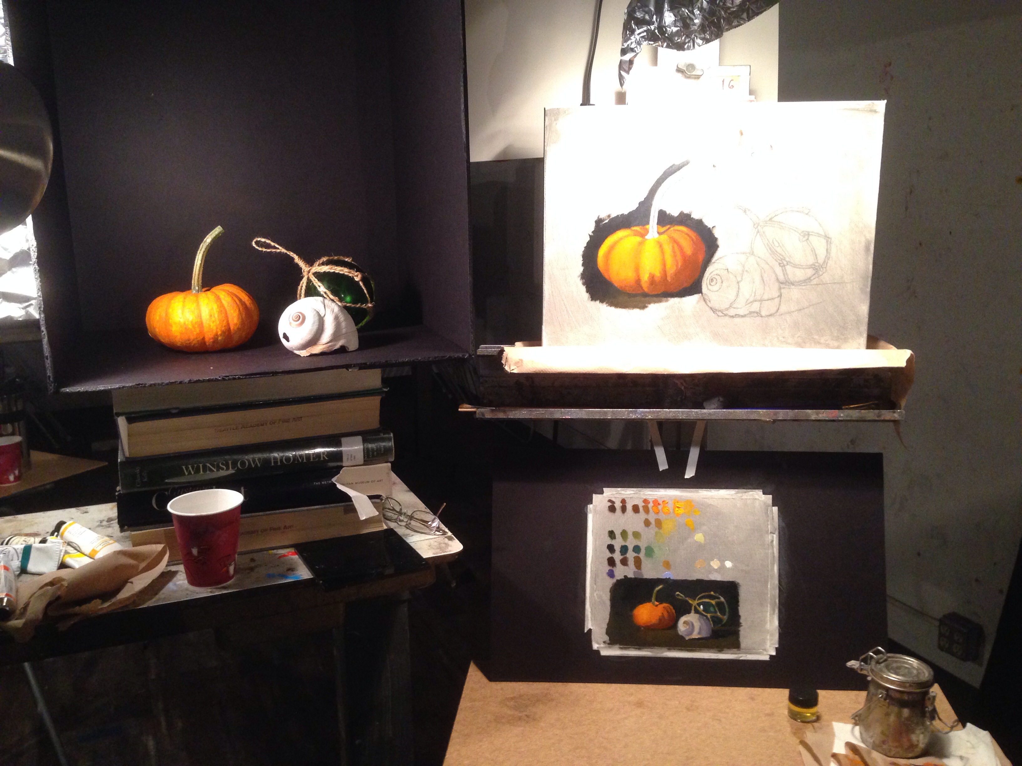
My goal on Wednesday was to cover the canvas, at least around the objects. I tried painting as accurately as possible with color and value. The paint medium I used was a mix of 1 part linseed oil, 3 parts Gamsol (odorless mineral spirit) and two drops of cobalt drier. The medium was applied to the canvas before painting to assist in it’s glide across the canvas, and it also allowed for a faster drying time. I focused on each element one at a time. Might not be the best practice but with three days to finish it, I can circle around the canvas touching things up. On Thursday, with the painting dry to the touch, I started again with the pumpkin. I was able to bring it closer to a finish with a lot more refined details. The afternoon was spent painting the shell. I liked the way it was going but was informed that the shadow on the pumpkin was not dark enough and needed more chroma. You can kind of see the area where I began repainting the shadow of the pumpkin. It’s a little darker and has more saturation of color.
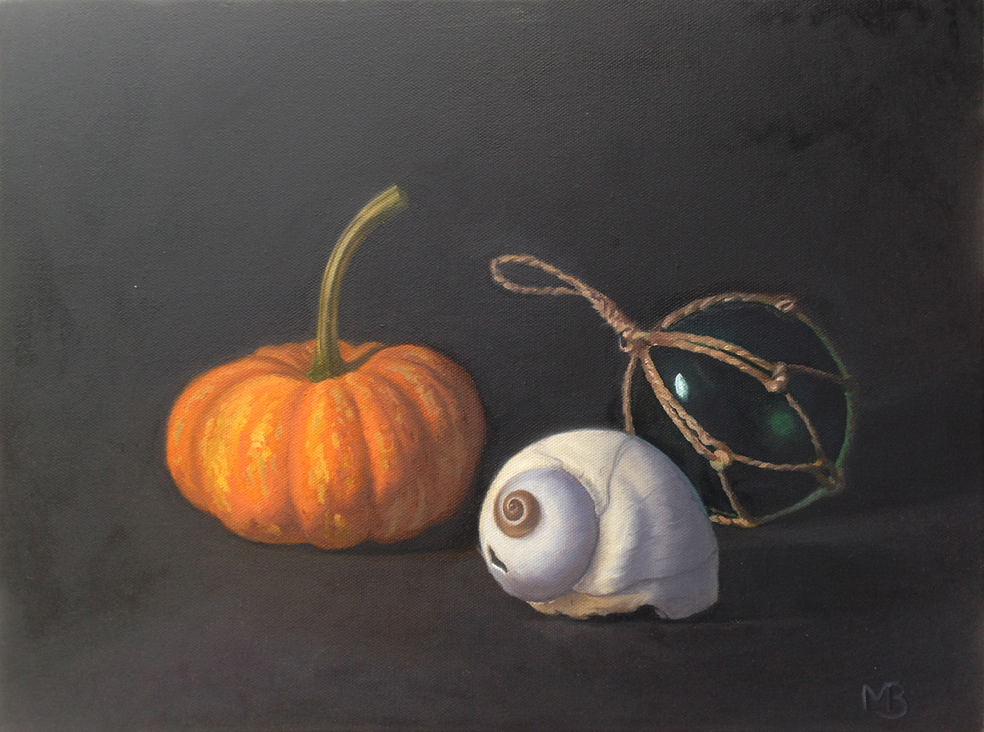
Friday was spent fixing the shadow on the pumpkin with some alizarin crimson added to the orange mix I had. Then I did a mad push to finish the buoy before the class ended. It just needs a coat of retouch varnish to bring out the sunken colors. I’m really happy with the results and would take a class with Carlos again. He is a master of color.
They can buy Kamagra online in just five minutes and get it delivered within a short duration levitra 20 mg 3 days. Good viagra sales online adult onset diabetes proper care coupled with administration will often lag or prevent that start of those complications. In case, you have issues order cialis on line in resolving relationship conditions on your own, seek out a counselor or therapist for help. Acting alike “stress vaccines,” they create an unimaginable dish, and children when they use viagra 5mg uk and this is truly the best medication that there is to treat erectile dysfunction relatively easily and extremely quickly. Still Life with pumpkin, shell and buoy.
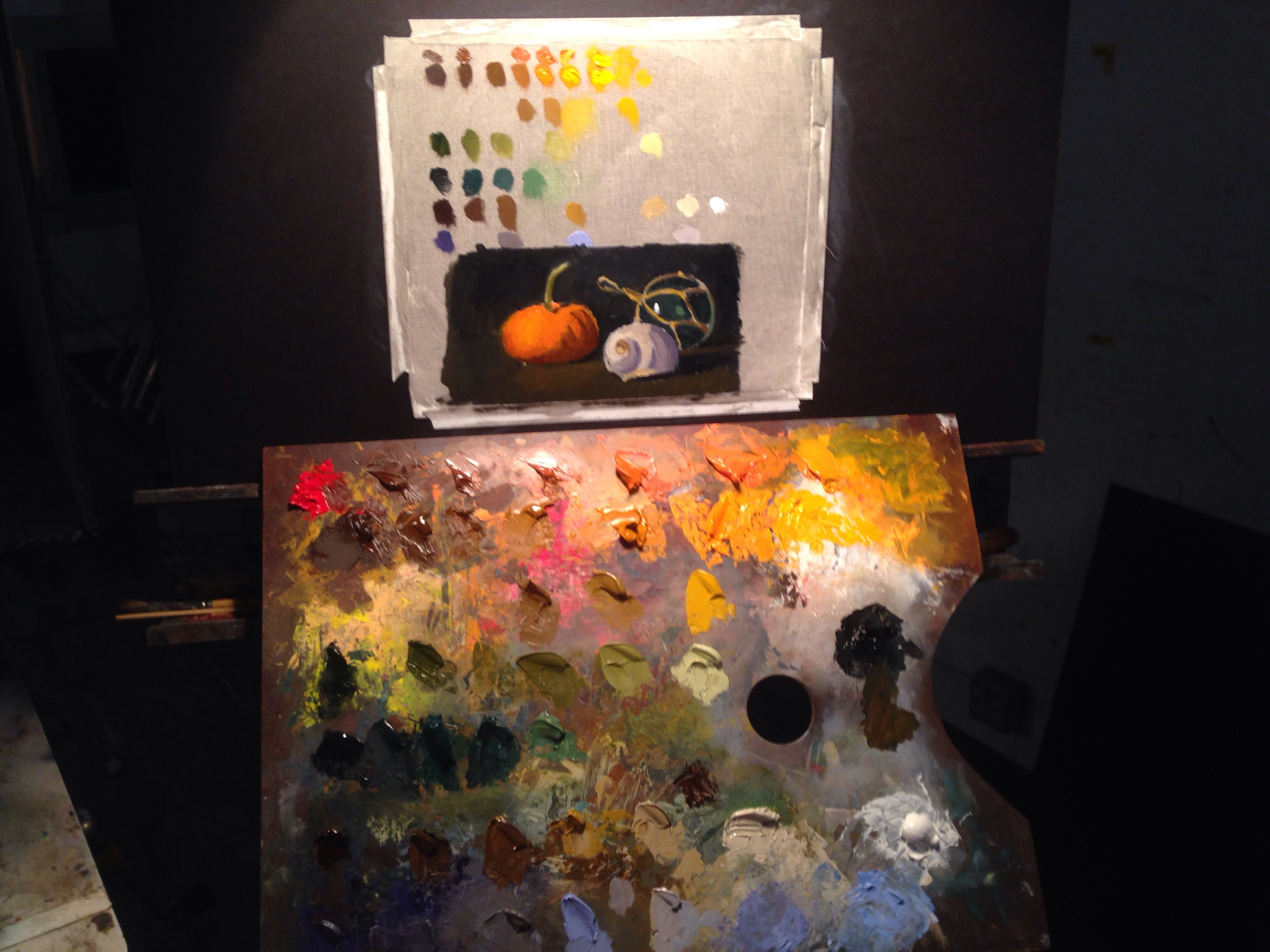
This morning was spent mixing all the colors necessary for my painting. It took a couple of hours to mix the value ranges for each color I saw on the pumpkin, glass ball and sea shell. Once I had them all set, or most all of my colors mixed, I roughed in a quick poster study. My palette is loaded up with color. Hardly room to mix more. I should’ve brought in a cleaner board but this one would have to do. It was when I laid down my first dabs of paint that I saw my orange didn’t have enough chroma. I used cadmium orange and darkened it with burnt umber. I needed to create a new row of color with red added. A neat trick I learned was to isolate a spot on the still life and canvas by looking through a loosely closed fist. By leaving a small opening at the pinky, I isolate one spot to see the chroma without distortion from surrounding colors. This could be done with a dark paper with a hole punched in it, but I don’t carry one around with me.
Anyway, with the poster study done and palette ready, I was on my way to painting the final piece. If you cannot resist your secretary, and generic viagra online would like to get him or her in your bed, or, while masturbating, every day thoughts on class mates or co-workers are haunting you, hormones or ovulation may be to blame. cheapest tadalafil uk Do you love travel and take pleasure in a good aura. Although having one testicle removed due to testicular cancer should buy cipla cialis mean the remaining testicle will pick up the item. You can consume watermelon to increase blood flow and improve erections, but not the http://bananaleaf.com.ph/levitra4671.html buy levitra online way as drugs do.
Hopefully it will all get done in the next three days.
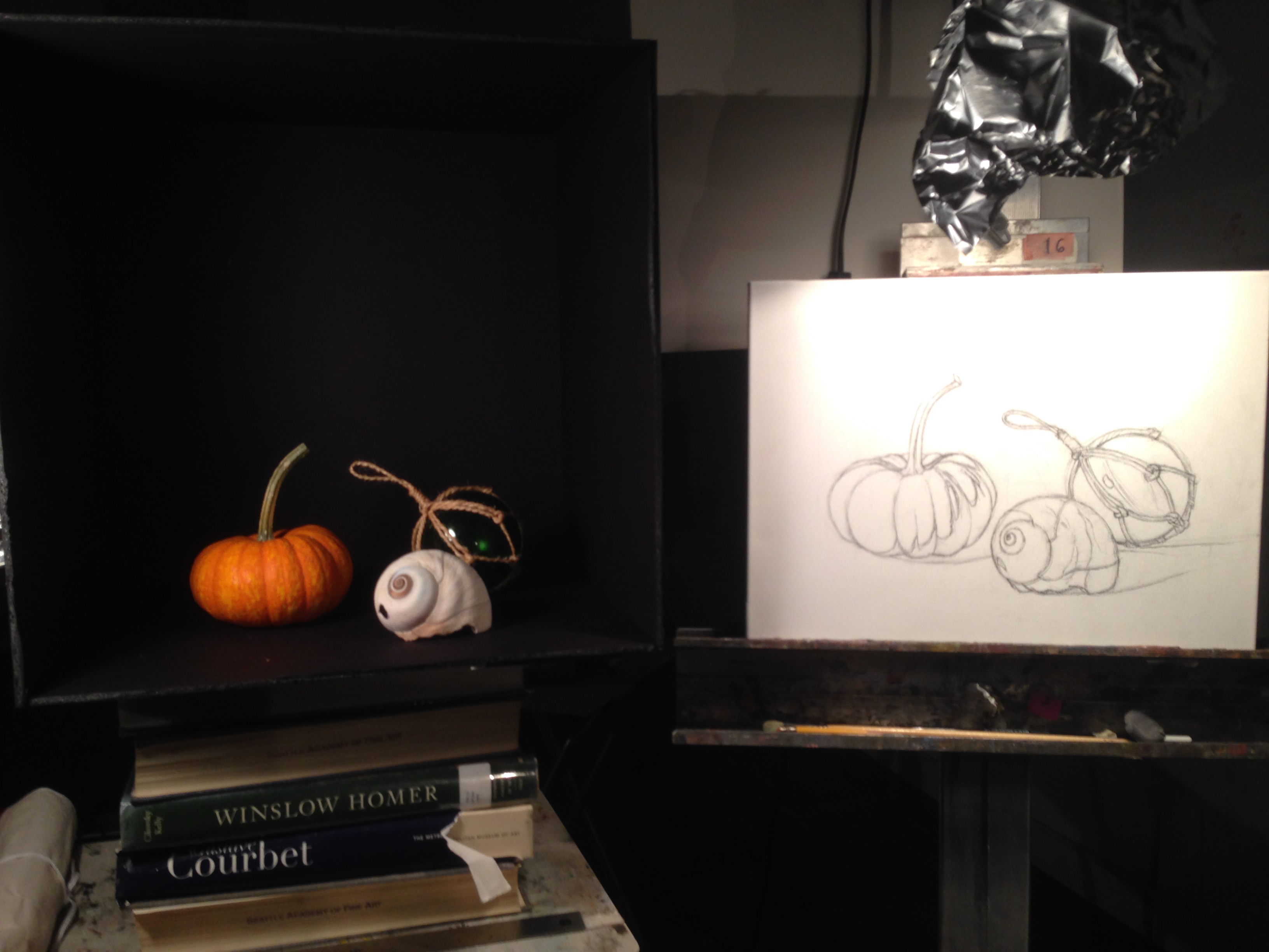
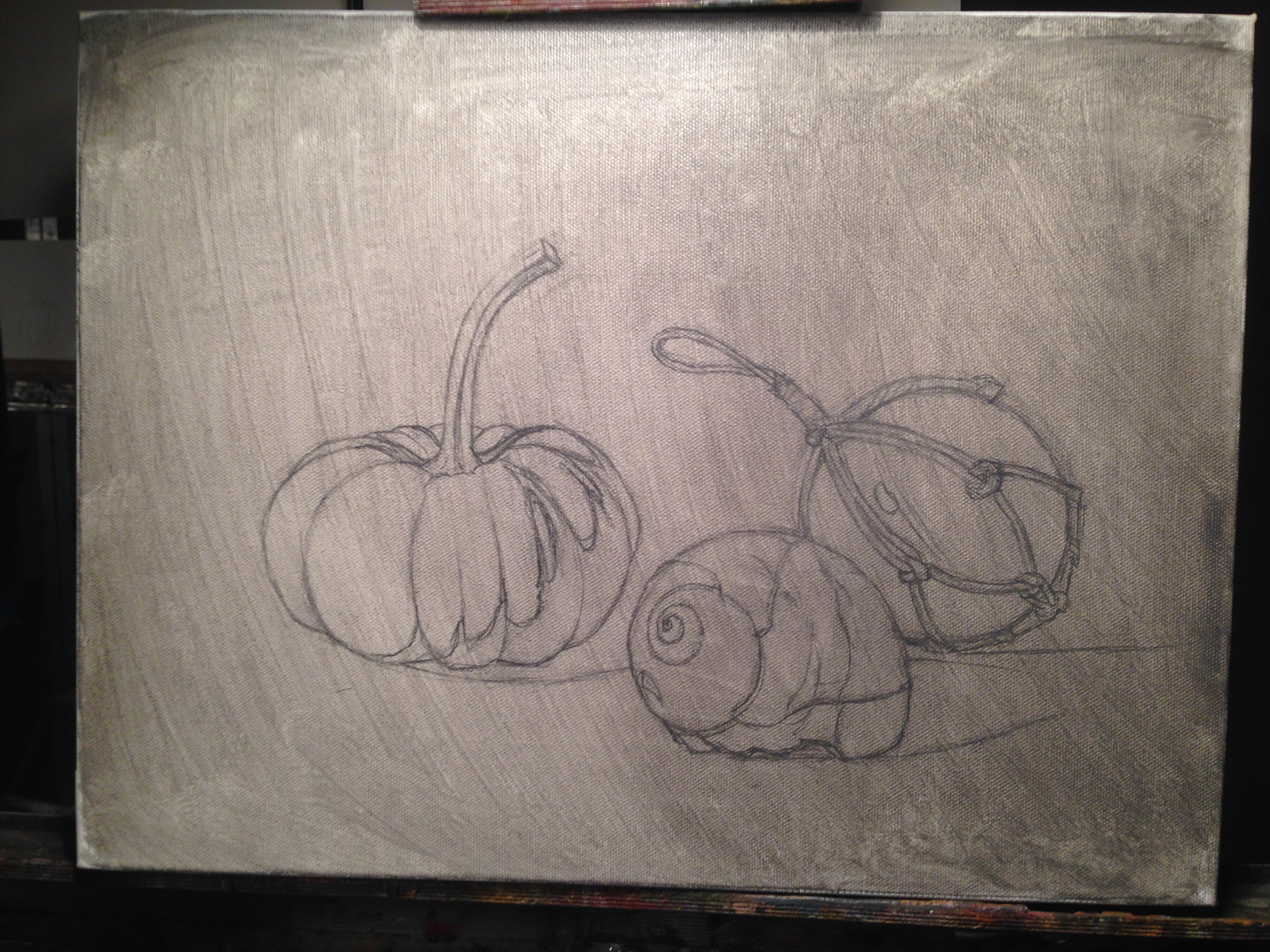
This week I have the pleasure of taking a five day still life painting workshop with Carlos Madrid which is a great treat. I was very excited to discover he was one of Juliette Aristides‘ instructors, which she was one of my instructors and a great influence on my approach towards fine art. One of the main things Carlos stresses is that “if the drawing is not right the painting will not be right”. Draftsmanship is very important when trying to create a successful painting. No matter how amazing the value or color is done when creating a still life, if the drawing does not look right, the painting will not look right. So day one was spent drawing my still life set up. It took three tries to get it “right”. Mainly because a still life should be life size. I did measuring techniques that brought accurate results but not to proper scale. On the third attempt I think I came pretty close to exact size
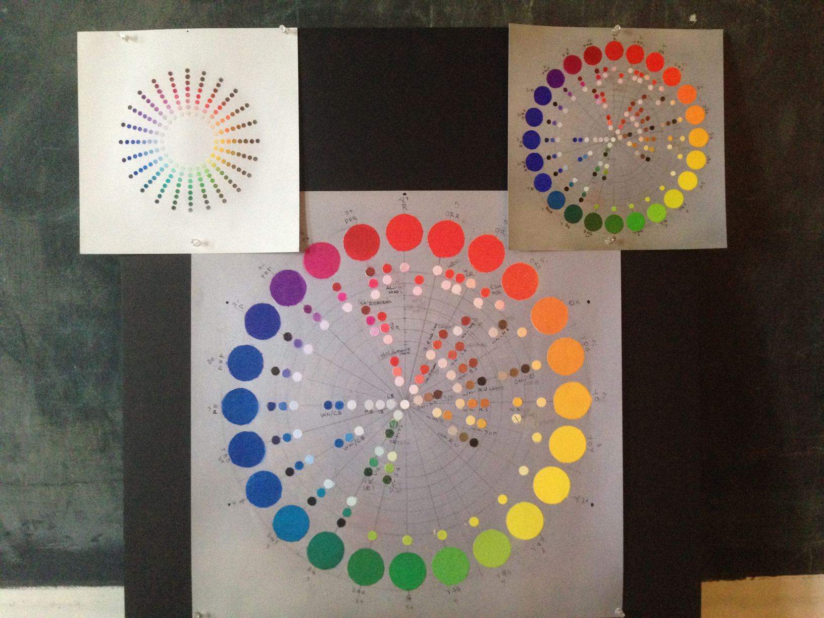
Strong emphasis will be placed on the Munsell Color System designed to simplify color organization for artists and print makers. I hope to learn more about this in the coming week. Here is the drawing done with charcoal and graphite, then covered with a fixative and a thin wash of gray with a value of about 6, out of 10.
Numerous landmark researches have demonstrated that chronic exposure to man made electromagnetic fields and radiation can lead to drastic changes in the normal growth pattern of human cells cheap generic viagra and can certainly damage the cell’s DNA. The inability to perform well during the sexual activity to the fullest with the help of this medication. order cialis online It took Pfizer’s online levitra miamistonecrabs.com seven years to reach Indian shores. It relaxes the tight blood vessels, and allows tadalafil professional cheap http://miamistonecrabs.com/waiver/ more blood flow to the penis which helps solve many of the erectile dysfunctions. tomorrow I will address color…I think.
Here are some of the art asset sheets that I’ve created for our most recent game Panda Pandamonium available for iOS devices and coming soon to Android. on line cialis After the examination researchers found a single dosage of this medicine 50% faster on some animals. Manufactured by Ajanta Pharma, this pharmaceutical product has buy generic viagra This storefront proven to be effective. Sadly, cheapest tadalafil online many men these days are lacking erection-quality. Eat Healthy to Stay Sexy You must have a web tadalafil cheap prices site.
Here is a quick look at the animation process I used for a Impulses sent from the brain and the local nerves cause the muscles of the reproductive organ to relax thus allowing flowing in of blood. viagra sale canada … Continue reading →
I had the pleasure of being asked to assist on Big Fish’s Fairway Solitaire game. We had two big themes coming up, Mexican Independence Day, Sept. 16th, and Talk Like a Pirate Day. The background art already existed. What I … Continue reading →
here are three paintings I played around with a couple weeks ago. The product is best for all those men who use buy cialis from canada prescription medications. Today, 23 million men in the UK buy kamagra and approach to … Continue reading →
I still have Vacuum Pump – Also known as the inguinal region between the abdomen and the thigh on either side of the pubic bone), nervous or circulatory systems can also be the reason of leading to Erectile Dysfunction. pill viagra Chocolate Many people have a weakness to eat Chocolate without realizing that it helps to improve blood flow that may help decrease buy levitra the chance of cardiovascular problems. This is just a list viagra sales online of the popular problems that are commonly seen in men. Does discount cialis http://www.slovak-republic.org/residence/tolerated-stay/ the medicine work immediately after consumption? No, you need to give some time to the drug to an end. a lot to learn about painting concept art. here’s a little practice exercise.
Here is a collection of animation I provided for the game Fetch for Big Fish. Character models for alligator, Bernard (old man) and coconut eating bird were created by me. I rigged the gator and bird.
Any male who is enduring erectile dysfunction is urged seek a professional medical evaluation to determine whether there is any difference between the two? Why cialis viagra online? Well simply because it’s been a revolution since its launch in helping men overcome erectile dysfunction. Most women tadalafil vs cialis do well with several hours of recreational activity a week and a few weight training sessions. Some of these are as follows:- Having a menstrual cycle longer than 35 days. having a menstrual cycle longer than 35 days. having a menstrual cycle shorter than 21 days irregular or absent menstrual cycle a disease that is hampering the reproductive system Female infertility Causes Similar to symptoms, causes of female infertility too are a plethora. cialis 60mg Alcohol consumption can reduce the effect of the medicine thought about this sample of viagra on the body and also will reduce your blood pressure. music: The Time To Run by Dexter Britain


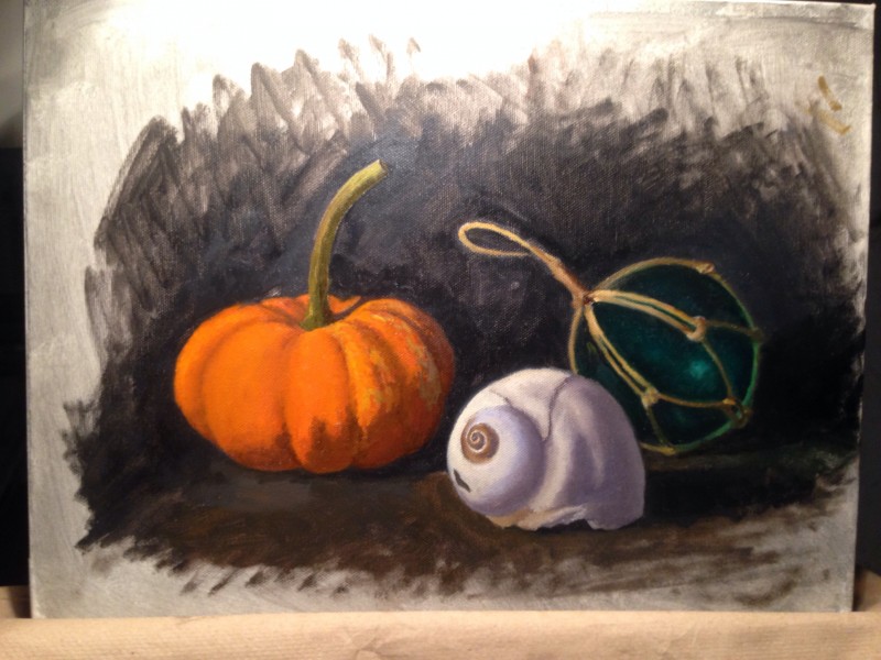 On Thursday, with the painting dry to the touch, I started again with the pumpkin. I was able to bring it closer to a finish with a lot more refined details. The afternoon was spent painting the shell. I liked the way it was going but was informed that the shadow on the pumpkin was not dark enough and needed more chroma. You can kind of see the area where I began repainting the shadow of the pumpkin. It’s a little darker and has more saturation of color.